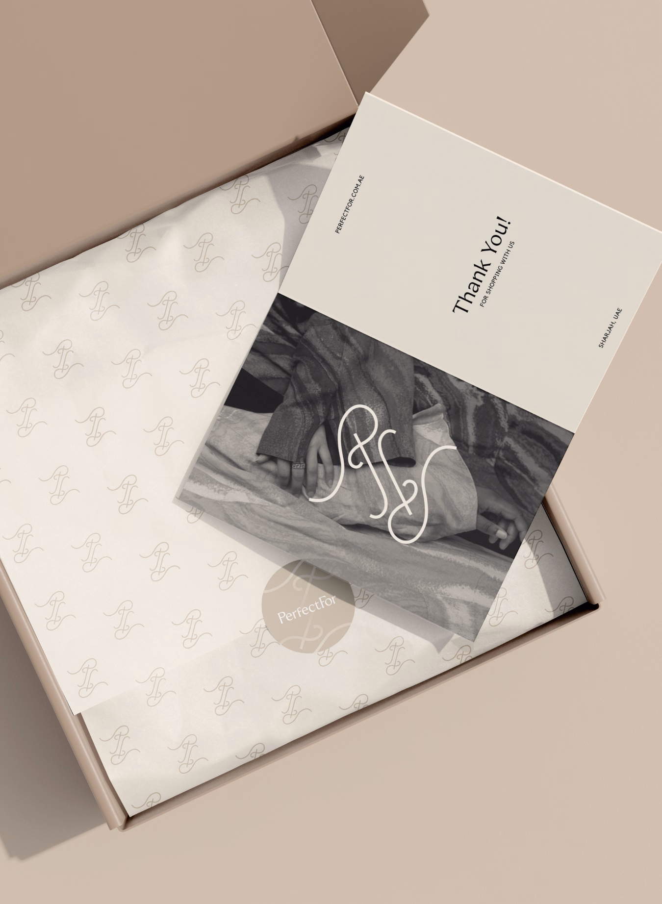
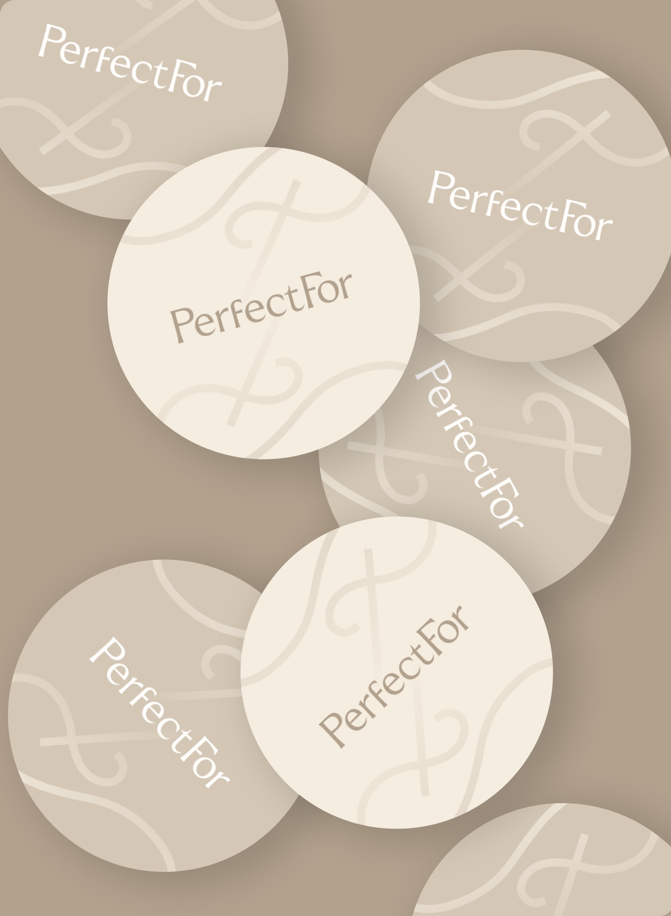
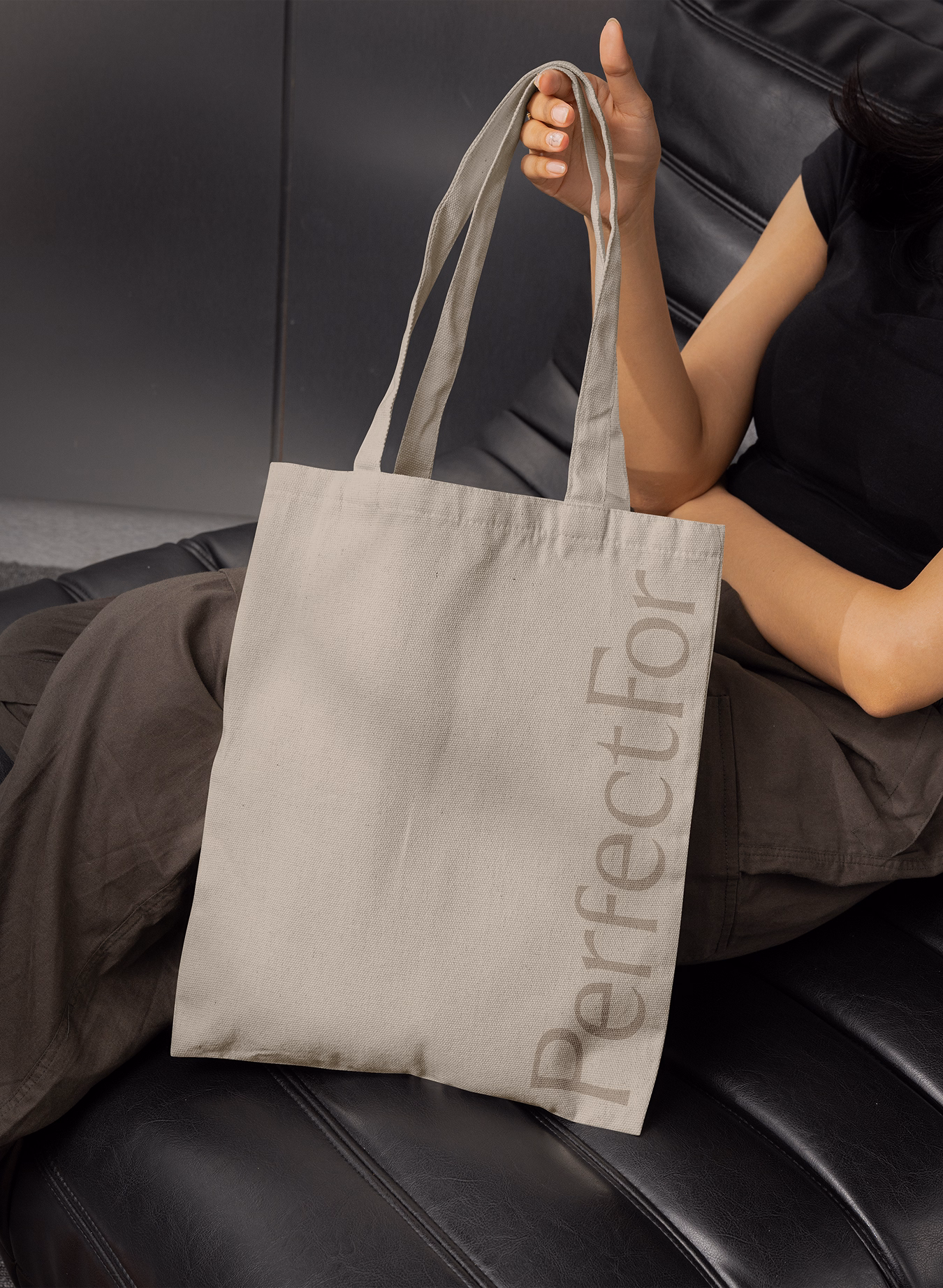
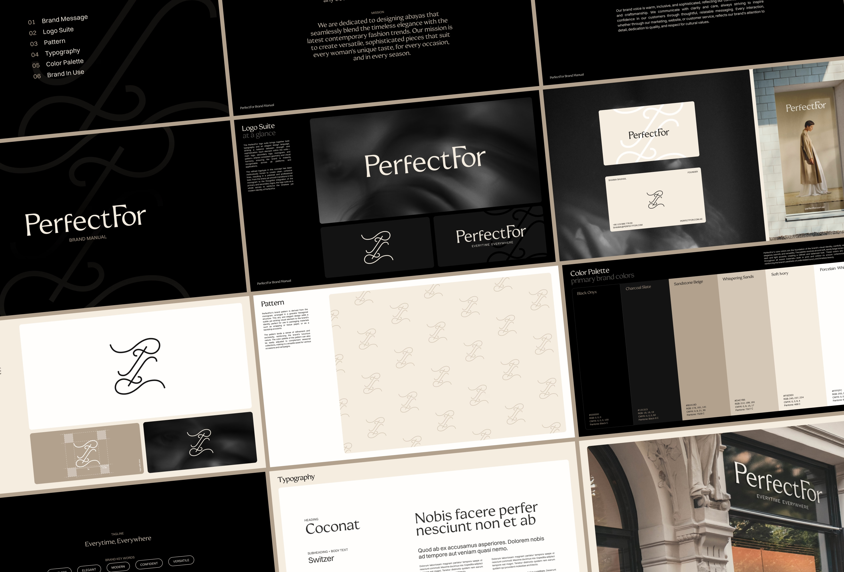
Color plays a vital role in bringing the brand to life. A soft, earthy base palette reflects the natural, tactile quality of PerfectFor’s textiles, while richer seasonal tones were introduced to add depth, freshness, and flexibility for special drops and limited collections. The result is a palette that adapts with the rhythm of modern life without losing its essence.
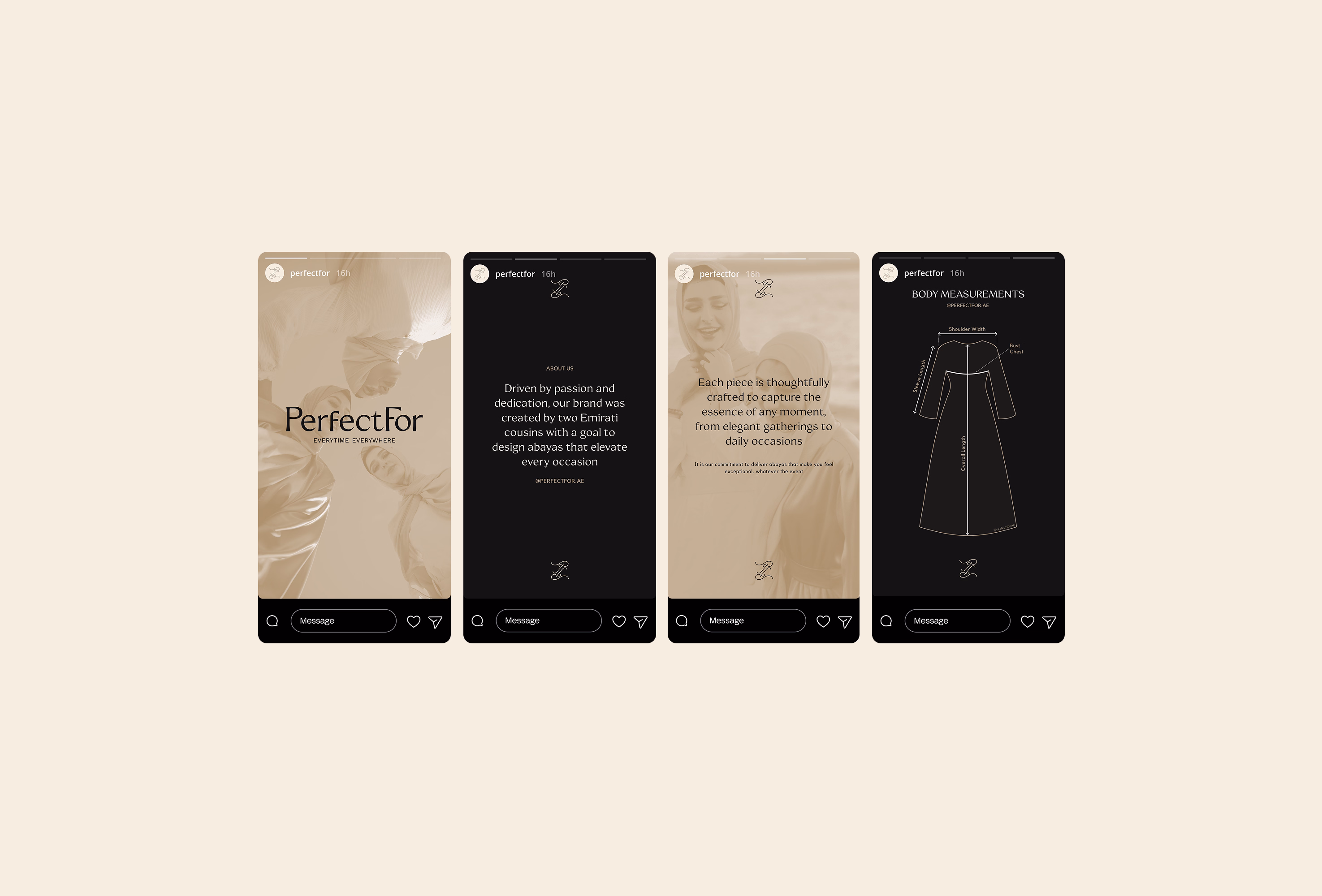
Typography and pattern design reinforce the brand’s calm, confident tone - minimal but memorable, structured but fluid. The system allows PerfectFor to express its identity consistently across e-commerce, social media, packaging, and printed materials. From strategy to execution, the entire brand identity was created to help PerfectFor feel rooted, refined, and effortlessly modern - designed to meet women exactly where they are, in every moment.

.svg)