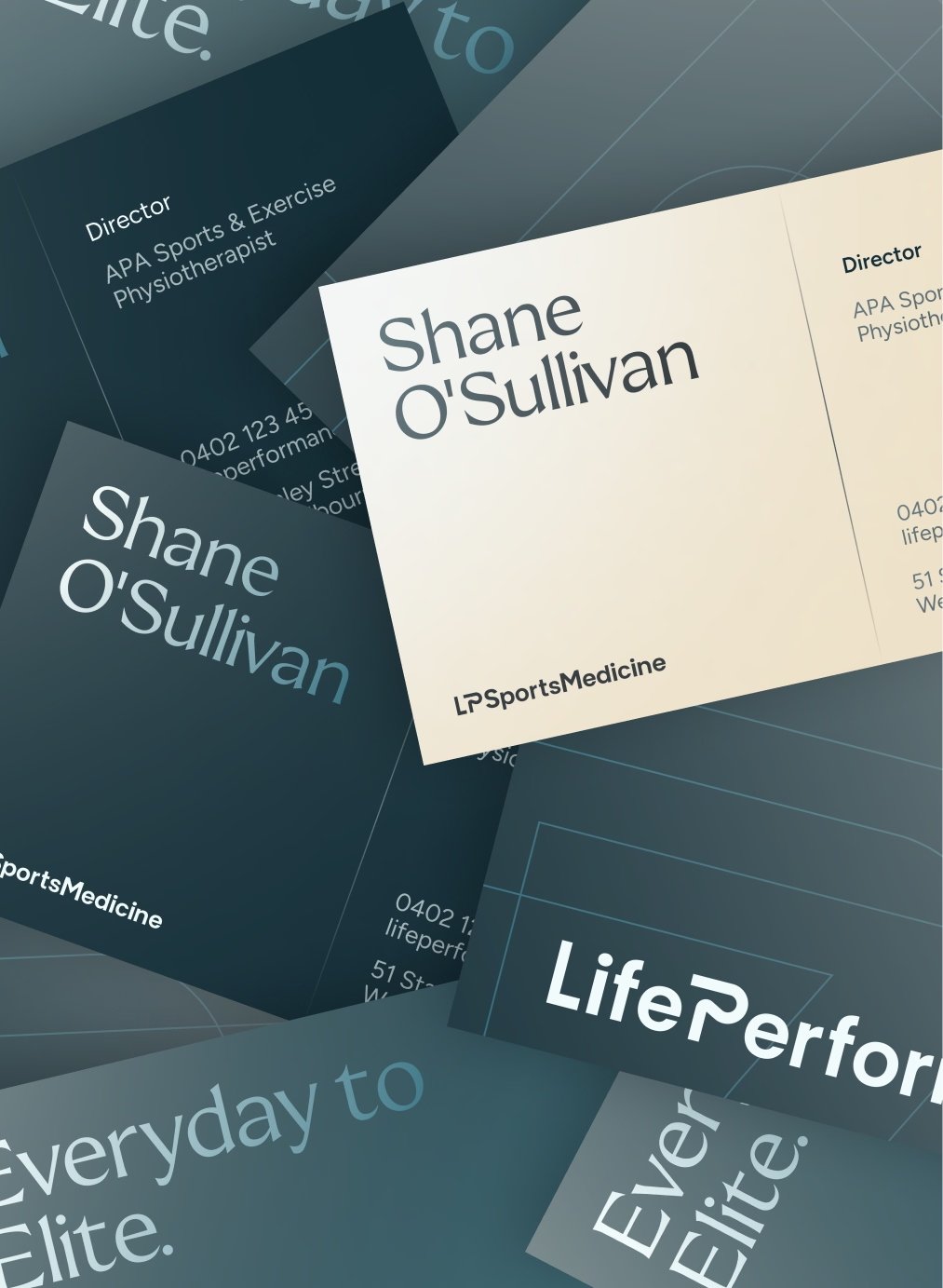
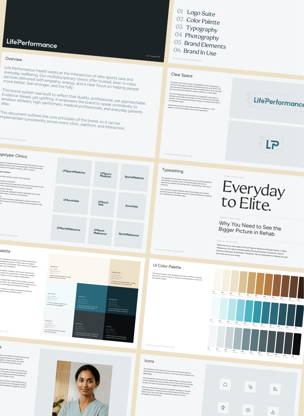
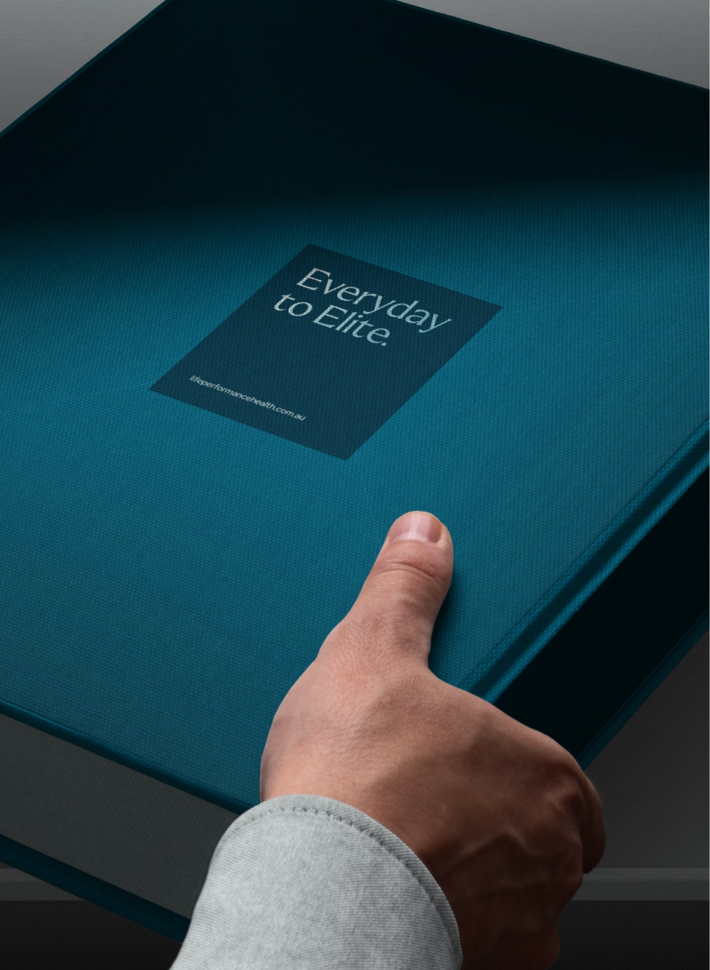
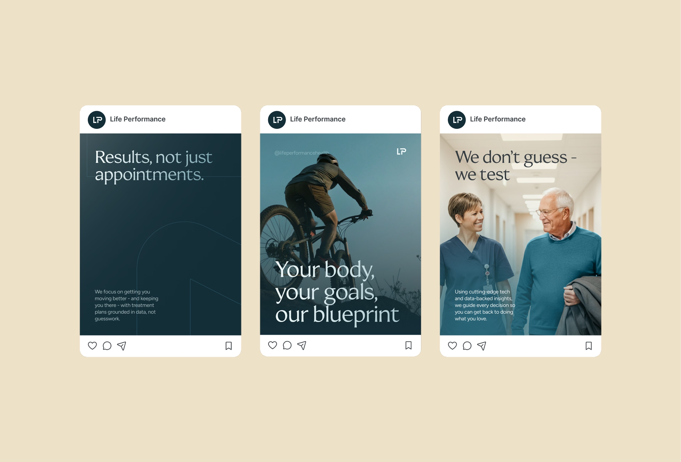
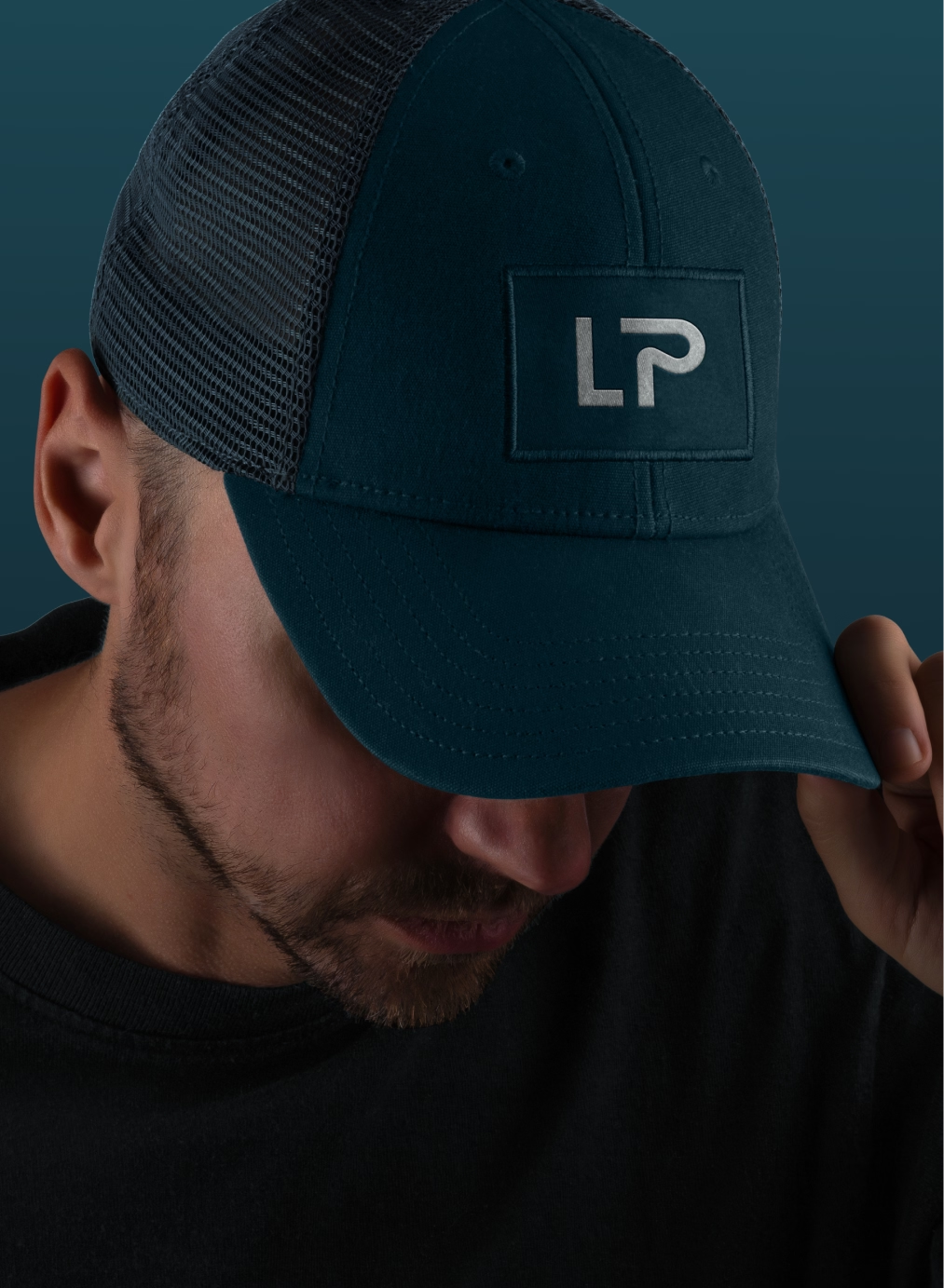
The refreshed identity balances clarity with energy. A customized logotype anchors the brand, with a distinctive “p” detail that subtly reinforces Life Performance’s movement-first ethos. Typography creates hierarchy and flexibility: Coconat delivers standout headlines with impact, while Figtree handles body text and UI applications with clean readability. The color system builds contrast and personality - calm neutrals and charcoal provide stability, while a bright teal injects forward motion and optimism. Photography was a key storytelling tool. Instead of sterile, clinical stock, the guidelines prioritize warm, candid imagery that showcases real clinicians, authentic interactions, and dynamic movement - outcomes that reflect the brand promise.
Grid systems, gradients, icons, and line-based patterns round out the design system, creating structure and visual rhythm without losing approachability. Together, these elements form a scalable identity that works seamlessly across digital platforms, print collateral, clinical environments, and future campaigns. Life Performance walked away with a cohesive, professional, and human-first identity. The new brand system doesn’t just look good - it builds recognition, communicates trust instantly, and scales seamlessly with the business. Today, LP’s identity supports their growth while staying true to their mission: empowering every client, from everyday movers to elite performers, to feel like the main character in their own health journey.

.svg)


.avif)